pbodhida-dataviz-portfolio
| home page | data viz examples | critique by design | final project I | final project II | final project III |
Critique and redesign - The NOAA Annual Greenhouse Gas Index (AGGI)
Step one: the visualization
The original visualization is from this academic article about the NOAA Annual Greenhouse Gas Index (AGGI): https://gml.noaa.gov/aggi/aggi.html
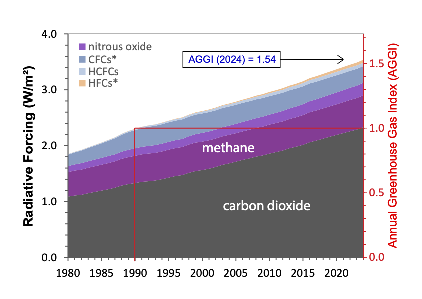
I chose this visualization because it contains multiple elements, such as 2 vertical axes, reference lines, legend, and annotation. I admired how the creator tried to communicate every aspects of information from the given data and added all elements mentioned, but this makes the chart very confusing. So, I find it challenging and exciting to redesign this chart. Moreover, I have never created a stacked area chart before, so I think this is a good opportunity for me to try working on that, and probably do something creative.
Step two: the critique
The visualization attempts to show the growth in radiative forcing compositions over time with a reference period, which is an interesting idea, and the area chart helps represent overall growth. However, the way AGGI and the reference line are presented makes it hard to understand the comparison between the reference period and other years. Some elements also reduce clarity, such as the lack of a title, unclear x-axis tick marks, inconsistent gas labels, and arbitrary color choices. Although the chart may still be readable for researchers or technically familiar audiences, it does not communicate the key insight clearly and does not reach its full potential.
In my redesign, I want to focus on highlighting the changes in radiative forcing compared to the reference period. I am considering using a surplus/deficit style chart to show increases and decreases more clearly. I may still use an area chart but only for major gases like CO₂ and methane, grouping the rest as “others.” I also plan to remove the AGGI right axis and instead show AGGI as annotations for key years. Additionally, I want to improve the overall design by adding a clear title and subtitle, using more consistent labeling, and experimenting with lighter colors and outlines to make the visualization more visually pleasing and easier to read.
Step three: Sketch a solution
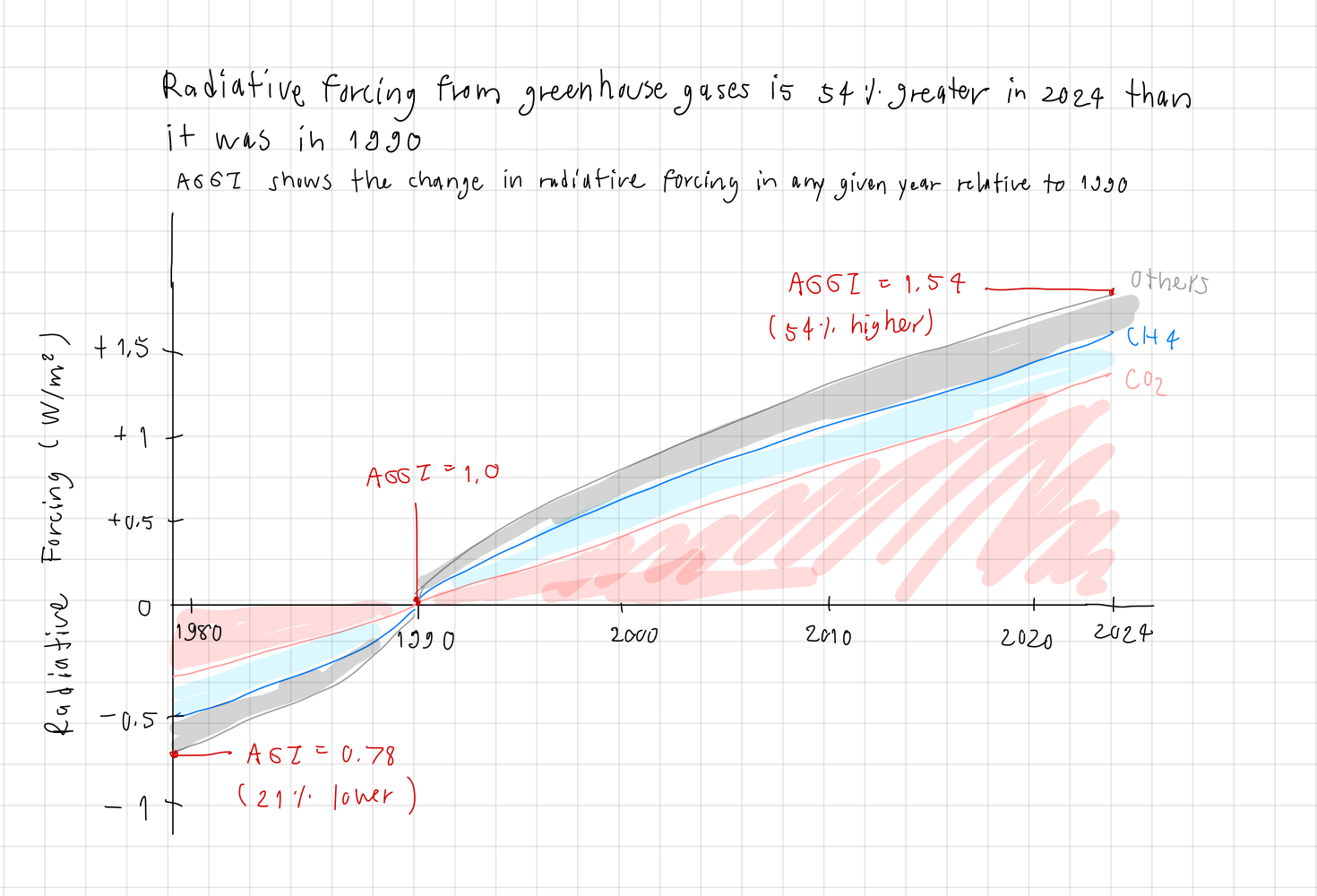
I decided that ‘the radiative forcing hit 54% increase in 2024’ will be my main focus to communicate for this redesign. Then, I considered doing the surplus/deficit style of stacked area chart to emphasize the change in radiative forcing relative to the reference point. This is mainly because I want to align the presentation with the AGGI definition, so I think the idea should revolve around comparisons to 1990. I decided to preserve the Radiative Forcing as vertical axis, retaining the original gas quantity information, and present AGGI index as annotations instead of an axis to reduce confusion. Because the chart shows the changes compared to 1990, I adjusted the vertical axis value to be incraeses/decreases of radiative forcing.
I grouped the other gases besides CO2 and Methan (CH4) into the ‘others’ group, avoiding unnecessary details that makes the chart too complex. I also changed ‘Methane’ to ‘CH4’ for consistency with ‘CO2’. I used 2 distinct colors to represent CO2 and CH4, and used grey for others to de-emphasize it. The gas names were placed at the end of the area, to reduce the need of legends and lower the eye movements. Lastly, I added the title to highlight my main idea, and also the subtitle to describe the AGGI definition.
Step four: Test the solution
These are the feedbacks I got from interviewees
| Question | Interview 1 | Interview 2 | Interview 3 |
|---|---|---|---|
| Can you describe to me what this is telling you? | Greenhouse gases increased from 1990 | Greenhouse gases increased from 1990 + CO2 is the biggest component | Greenhouse gases increased from 1990 + CO2 is the biggest component |
| Is there anything you find surprising or confusing? | I am not sure where 54% is in the chart | I think the red color of CO2 seems alarming, is it intentional? | The y-axis shows the absoluate value of radiative forcing, or the changes? |
| Who do you think is the intended audience for this? | researchers | students, environmentalists | researchers, students |
| Is there anything you would change or do differently? | No, after I read the AGGI definition, I understood how 54% increase is related, I also think the red annotations stand out well, however, I think the color legend will work better than the current gas labels | It should use colors that are neutral, not suggesting good nor bad | The y-axis label should say that it’s the change in radiative forcing |
Synthesis: Overall, I think the readers get the main idea that the chart communicates, that the greenhouse gases have increased significantly from 1990. I learned that the stacked area works well to show the greengas components, and the surplus/deficit style presents the main idea very well. There’re still some confusing elements, such as colors and axis labels, that should be fixed. I will try to use neutral colors for gas components, and fix the y-axis label. As for adding the legend, I am not sure because I want to limit the eye movement, although I admit that the current design may make it hard to see the gas names. I will see what I can do in Tableau.
Step five: build the solution

First, I created new calculated fields (changes relative to 1990) and used a stacked area chart. I noticed that when using the change, not the original quantity, CH4 area was too small to show. So, I decided to only do CO2 and Others. Secondly, I fixed all issues mentioned in the previous section (colors and axis labels), and I also changed the AGGI describtion color to red, so it’d be easier to read and associate with AGGI annotations in the chart area. Lastly, I could not find a way to move the x-axis to the 0 line of y-axis. So, I drew a dash line at 1990 to make the reference point more obvious.
In summary, I think the critique step is very helpful in organizing thoughts about aspects of the visualization, so we really think through every aspect. The sketching step is also very important to freely express your idea, unlike jumping to use the program which may limit your creativity. The testing step is crucial to get feedbacks, because even when we think carefully about our visualizations, there probably are some elements that we missed, and those can only be detected by critiques from other readers.
References
The visualizations source: https://gml.noaa.gov/aggi/aggi.html